
- 분류 전체보기 (859)

Notice
Recent Posts
Recent Comments
Tags
- 404에러페이지
- ViewBag
- asp.net dropdownlist
- 하드 윈도우 복사
- 바코드 생성하기
- 강제이동
- 원격ftp
- jquery 바코드생성
- JavaScript
- php 캐쉬제거
- 맥 오라클설치
- simpe ftp
- django 엑셀불러오기
- ViewData
- XSS PHP
- ASP.Net Core 404
- TempData
- Mac Oracle
- asp.net core Select
- javascript 바코드 생성
- 말줄임표시
- asp.net Select
- javascript redirection
- asp ftp
- XSS방어
- 하드 마이그레이션
- SSD 복사
- swagger 500 error
- 타임피커
- asp.net core swagger
웹개발자의 기지개
[Python] matplotlib 실습하기 1 본문
matplotlib 설치
pip3 install matplotlib
|
1
2
3
|
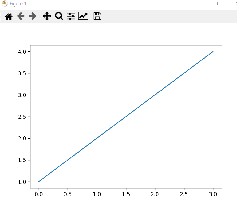
import matplotlib.pyplot as plt
plt.plot([1,2,3,4])
plt.show()
|
cs |
|
1
2
3
4
5
6
|
import matplotlib.pyplot as plt
x = range(0,100)
y = [v*v for v in x] # x(0에서 99까지)에서 v값을 하나씩 돌리는데, 결과값은 v*v
plt.plot(x,y,'ro') # 빨간색 원점으로 표시
plt.show()
|
cs |

|
1
2
3
4
5
6
|
import matplotlib.pyplot as plt
fig = plt.figure()
ax1 = fig.add_subplot(2,1,1)
ax2 = fig.add_subplot(2,1,2)
plt.show()
|
cs |

|
1
2
3
4
5
6
|
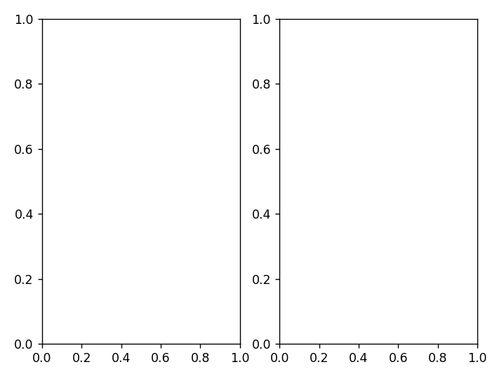
import matplotlib.pyplot as plt
fig = plt.figure()
ax1 = fig.add_subplot(1,2,1)
ax2 = fig.add_subplot(1,2,2)
plt.show()
|
cs |
|
1
2
3
4
5
6
7
8
9
10
11
12
13
|
import matplotlib.pyplot as plt
fig = plt.figure()
ax1 = fig.add_subplot(2,1,1)
ax2 = fig.add_subplot(2,1,2)
x = range(0,100)
y = [v*v for v in x]
ax1.plot(x,y)
ax2.bar(x,y)
plt.show()
|
cs |

|
1
2
3
4
5
6
7
8
9
10
11
12
13
14
15
16
17
18
19
20
21
22
23
24
|
import numpy as np
import matplotlib.pyplot as plt
# 0에서 0.1 간격으로 2 파이 사이에 x값 뽑기
x = np.arange(0.0, 2*np.pi, 0.1)
#print(x)
sin_y = np.sin(x)
cos_y = np.cos(x)
fig = plt.figure()
ax1 = fig.add_subplot(2,1,1)
ax2 = fig.add_subplot(2,1,2)
ax1.plot(x,sin_y,'b--')
ax2.plot(x,cos_y,'r--')
ax1.set_xlabel('x')
ax1.set_ylabel('sin(x)')
ax2.set_xlabel('x')
ax2.set_ylabel('cos(x)')
plt.show()
|
cs |

|
1
2
3
4
5
6
7
8
9
10
11
12
13
|
import pandas_datareader.data as web
import matplotlib.pyplot as plt
# pip install pandas-datareader 설치할것
lg = web.DataReader('066570.KS','yahoo')
samsung = web.DataReader('005930.KS','yahoo')
plt.plot(lg.index, lg['Close'], label='LG Electronics')
plt.plot(samsung.index, samsung['Close'], label='Samsung Electronics')
plt.legend(loc='upper left')
plt.show()
|
cs |

|
1
2
3
4
5
6
7
8
9
10
11
12
13
14
15
16
17
18
19
20
|
import matplotlib.pyplot as plt
#fig = plt.figure()
#ax_list = [[0 for i in range(2)] for j in range(2)] # [[0,0],[0,0]]
#ax_list = [[0]*2] * 2 # [[0,0],[0,0]]
#ax_list = fig.add_subplot(2,2,1)
#ax_list = fig.add_subplot(2,2,2)
#ax_list = fig.add_subplot(2,2,3)
#ax_list = fig.add_subplot(2,2,4)
#plt.show()
# figure 객체생성과 ax_list 객체로 2X2 그리드 만들기를 동시에
fig, ax_list = plt.subplots(2,2)
ax_list[0][0].plot([1,2,3,4])
#print(type(ax_list))
#<class 'matplotlib.axes._subplots.AxesSubplot'>
plt.show()
|
cs |

[ 캔들 차트 만들어보기 ]
|
1
2
3
4
5
6
7
8
9
10
11
12
13
14
15
16
|
import pandas_datareader.data as web
import datetime
import matplotlib.pyplot as plt
import mpl_finance
start = datetime.datetime(2016,3,1)
end = datetime.datetime(2016,3,31)
skhynix = web.DataReader("000660.ks","yahoo",start,end)
fig = plt.figure(figsize=(12,8))
ax = fig.add_subplot(111) # fig.add_subplot(1,1,1) 와 같은 표현
mpl_finance.candlestick2_ohlc(ax,skhynix['Open'],skhynix['High'],skhynix['Low'],skhynix['Close'],width=0.5, colorup='r', colordown='b')
plt.show()
|
cs |
실행하니깐, mpl_finance 가 Deprecate 된 녀석이다. ㄷㄷ


참고 : wikidocs.net/4760
'python > 파이썬 교육' 카테고리의 다른 글
| [Python] random.radrange함수, random.sample함수 익히기 - 로또번호 구하기 (0) | 2021.05.24 |
|---|---|
| [Python] for 문 정리 - key, value, items(), keys() (0) | 2021.05.05 |
| [Python] 클래스3 - 상속 (0) | 2021.05.05 |
| [Python] 클래스2 - 클래스변수, 인스턴스 변수 (0) | 2021.05.05 |
| [Python] Pandas 2 예제 (0) | 2021.05.05 |
'python/파이썬 교육' Related Articles
more


Comments